If I had to build a plumber’s homepage from scratch in 2026 with a single goal — book the call — this is exactly what would be above the fold, and why.
A plumber’s homepage has exactly one job: get the phone to ring. Everything else — the hero photo, the ‘about us,’ the values statement, the year-the-company-was-founded badge — is in service of that one outcome, or it’s in the way of it. Most plumber homepages I see in the Inland Empire are designed as if they were architecture firms: identity-first, conversion-second. This is the version I would build instead.
Walk through it section by section. Each one solves a specific psychological objection the homeowner has when they land on the page in the middle of a leak.
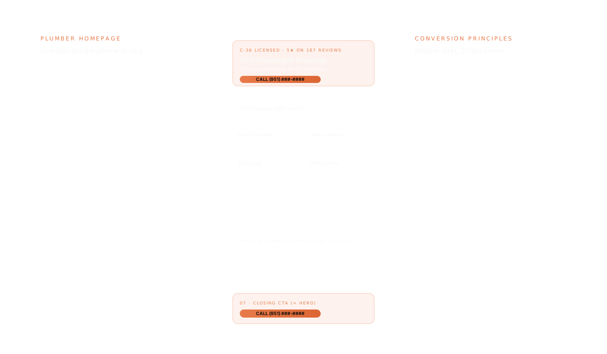
Section 1: The 3-second answer
Above the fold, on mobile (375px wide, because that’s where 70% of plumbing emergency searches happen), the user sees four things and only four things:
- Business name with C-36 license number (trust)
- One-line value prop: ‘24/7 Plumbing in Riverside, Corona & Moreno Valley — On Your Driveway in 45 Minutes.’ (specificity)
- Tappable phone number, large, in a button that looks like a button (call to action)
- Single trust signal: ‘5★ on 187 Google Reviews · Since 2009’ (validation)
No hero slider. No video background. No stock photo of a smiling plumber with a wrench. Those are all conversion poison — they delay the user from finding the phone number and they slow the page down. The hero is a calm, single-color background and four pieces of information.
Section 2: The emergency lane
Below the hero, before anything else, a single section: ‘Pipe leaking right now?’ with a big phone-tap CTA and a 1-line reassurance — ‘We dispatch in 15 minutes. After-hours rate clearly disclosed on the call.’ Roughly 40% of plumbing traffic is in emergency intent. Service them first, surface the booking flow second.
Section 3: The four services that book 90% of revenue
Not a 14-service grid. The Pareto principle says four services do 90% of the booking. For most Inland Empire plumbers those are: drain cleaning, water heater repair/install, slab leak detection, and emergency repair. Four cards, big icons, one-line descriptions, clicking each one goes to its own substantive service page (not a modal — a full URL Google can index).
Why four and not twelve: paradox of choice. Adding the eight less-common services to the homepage doesn’t drive bookings for those services — they’re booked by repeat customers or by people who search the specific term and land on the service page directly. The homepage is for first-time, high-intent visitors who already know they need a plumber, not customers shopping for unusual specialties.
Section 4: Proof — but the right kind
Three real Google reviews, with the customer’s first name and last initial, the date, and the specific job described. Not the generic ‘Great service! Highly recommend!’ — the specific ‘They came out at 11pm on a Tuesday and replaced our water heater the same night for the price they quoted on the phone.’ Specificity is what makes social proof actually move trust. Generic 5-star carousels do nothing.
Below the reviews: a single trust block with the license number, insurance details, BBB rating, years in business, and service area cities. All facts, no fluff.
Section 5: ‘Are you in our service area?’
Not a Google Maps embed (slow, gives Google a heads-up to redirect users to competitors’ Map Pack listings). A simple list of cities and a one-line ‘Outside this area? Call us anyway — we may still be able to help.’ The cities listed link to individual city landing pages, which themselves rank for ‘plumber [city]’ queries.
Section 6: The four questions that prevent the call
Four FAQs, no more, addressing the specific objections that keep an undecided user from calling:
- ‘How much will it cost?’ — Honest answer with typical price ranges for common jobs. The plumbers who refuse to give ballpark prices lose to the ones who do.
- ‘Are you really 24/7?’ — Specific answer about after-hours dispatch.
- ‘Are you licensed and insured?’ — License number, insurance details.
- ‘How fast can you actually get here?’ — Specific honest answer: ‘Typically 45 minutes within Riverside city limits. Up to 90 minutes in Eastvale or Jurupa Valley.’
Section 7: The closing CTA — same as section 1
Bottom of the page, identical CTA block to section 1. Phone number, tappable, large. No form. Forms are for non-emergency plumbing. Emergency plumbing is a phone call. Make the phone call the only action on the page that matters.
What I deliberately leave off
- Hero slider (kills LCP, distracts from CTA)
- ‘About Us’ section on homepage (lives on its own page for people who want it)
- Blog teaser carousel (blog has its own URL)
- Newsletter signup (wrong audience for a plumbing site)
- Social media icons in the header (every click off the homepage is a lost booking)
- Stock photography (kills trust the moment a user clocks it)
The result is a homepage that loads in under 1.5s on a mid-range Android, ships under 80KB of JavaScript, ranks for the queries that matter, and answers the homeowner’s one real question — ‘can you fix this fast?’ — in the first three seconds. That’s the entire job. Everything else is decoration.
If you’re a plumber in Riverside, Corona, or anywhere in the Inland Empire and your homepage looks more like a brochure than a booking machine, the contact form is open. I’ll send you a concept sketch for your specific situation, no obligation.